


What is NautiNati?
Designed for Parents
Focused on kidswear simpler, clearer trustworthy for parents.

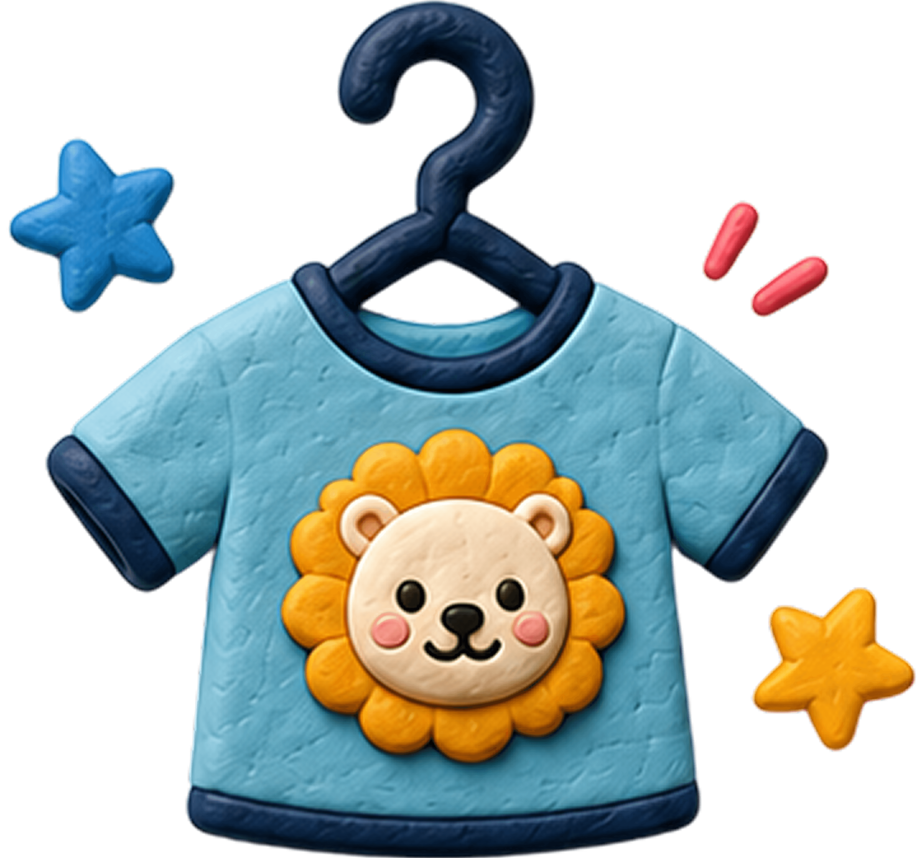
Playful Brand
A softer and more engaging kidswear with modern fashion.

Comfort With Style
Built around soft fabrics, everyday wear, and designs.


The Problem
Parents struggled to quickly understand key product details while shopping.
The UI looks good, but the UX felt confusing
Key highlights like fabric & comfort lacked visibility.
The PDP lacked trust cues and playful storytelling.
Sneha
2+ Years user
The only problem i face is taking time to understand fabric & comfort details of the product.
Aditi
Ahhh Couldn't find softness & care info lil frustrating

Priya
Product highlights felt buried inside long descriptions.

Meera
The one thing which i feel miss is the product detail i mean where is the product detail in clear?
The Process
I analyzed the existing PDP experience, studied competitor brands, and identified missing trust cues for parents.
Analyzed the overall PDP experience and user pain points.
Brainstormed with Business & PM Team
Ideated & Wireframed ideas to execute

Design Explanation
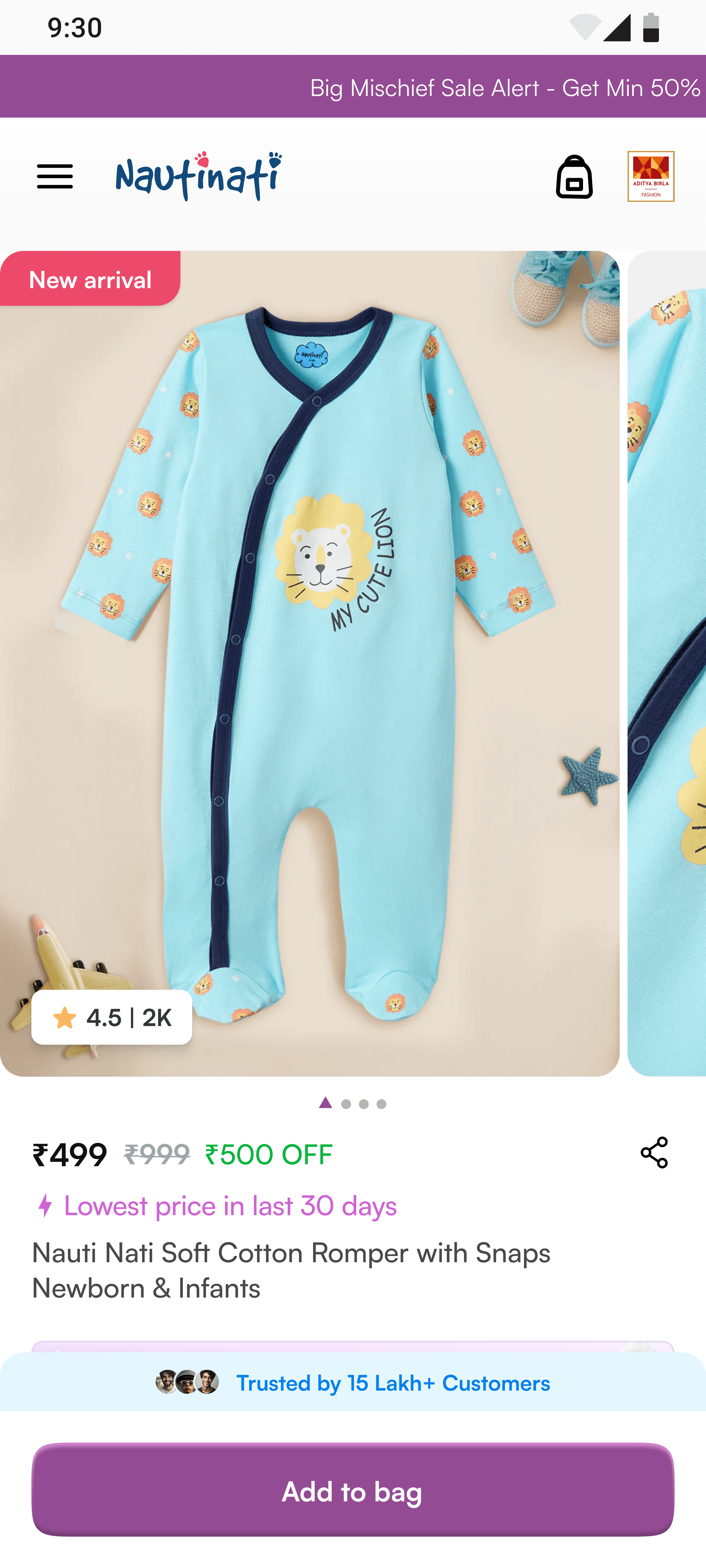
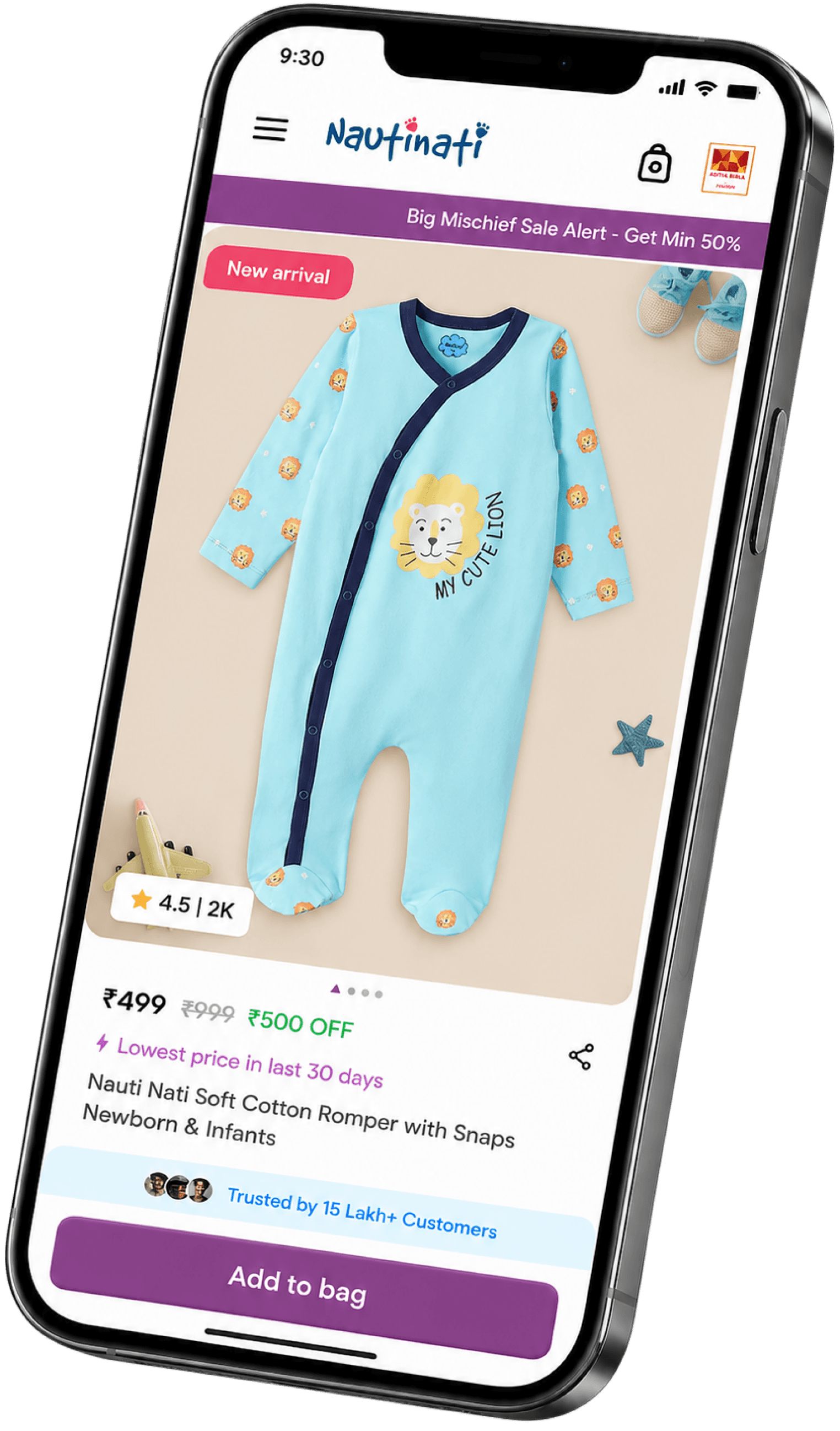
To improve quick product understanding, We moved ratings inside the product image to improve visibility and build quicker trust. The share action was placed closer to product details, while the sale timer was positioned near pricing to make offers instantly noticeable and more urgency-driven.
To reduce long reading and improve quicker decision-making, we introduced a playful iconography system that visually highlighted key product benefits like softness, breathability, and cotton fabric. We also added a dedicated “Key Highlights” section to help parents quickly understand important product details without scrolling through lengthy descriptions.
Through heatmap analysis, we noticed parents were looking for care instructions but dropping off before reading long descriptions. To improve this, we simplified the content into quick bullet points for faster understanding and redesigned trust markers like returns, shipping, and COD in a more playful and engaging way.
Design Explanation
We explored multiple layouts for key highlights, trust markers, product hierarchy, and storytelling and tried different possible ways to make the PDP clearer, more playful, and easier for parents to understand.
Worked closely with developers to refine playful details like the bubble swirls and UI interactions. Some parts got tricky during implementation, but after a few iterations, we balanced both usability and visuals well.

The how & why is important
Simply conclusion of the story. The UX improvements focused on helping parents understand products faster and shop with more confidence lil easier.
1
Quick Product Clarity
Important details like cotton fabric, softness, and comfort were moved higher for faster understanding.
2
Faster Scanning Experience
3
Trust-Driven Shopping
Here to answer
Here i am answering before that well, before that thanks for scrolling and reading this much
What was your biggest learning from this project?
Learned how small UX improvements and clearer product communication can directly influence buying confidence and actually help business improve their revenue in return
How did you collaborate with developers?
What challenge did you face during the redesign?